Goal
"Delving into the World Happiness Report, this analysis seeks to illuminate the multifaceted interplay between a country's economic prosperity, social fabric, health metrics, and the freedoms granted to its populace. As nations strive for greater contentment among their citizens, understanding these dynamics is paramount. The overarching objective of this exploration is not just to quantify happiness but to discern the primary, often subtle, drivers that underpin the collective well-being of nations globally.
Import the Data
import pandas as pd
happiness = pd.read_csv("data.csv")
happiness
| Overall rank | Country or region | Score | GDP per capita | Social support | Healthy life expectancy | Freedom to make life choices | Generosity | Perceptions of corruption | |
|---|---|---|---|---|---|---|---|---|---|
| 0 | 1 | Finland | 7.769 | 1.340 | 1.587 | 0.986 | 0.596 | 0.153 | 0.393 |
| 1 | 2 | Denmark | 7.600 | 1.383 | 1.573 | 0.996 | 0.592 | 0.252 | 0.410 |
| 2 | 3 | Norway | 7.554 | 1.488 | 1.582 | 1.028 | 0.603 | 0.271 | 0.341 |
| 3 | 4 | Iceland | 7.494 | 1.380 | 1.624 | 1.026 | 0.591 | 0.354 | 0.118 |
| 4 | 5 | Netherlands | 7.488 | 1.396 | 1.522 | 0.999 | 0.557 | 0.322 | 0.298 |
| ... | ... | ... | ... | ... | ... | ... | ... | ... | ... |
| 151 | 152 | Rwanda | 3.334 | 0.359 | 0.711 | 0.614 | 0.555 | 0.217 | 0.411 |
| 152 | 153 | Tanzania | 3.231 | 0.476 | 0.885 | 0.499 | 0.417 | 0.276 | 0.147 |
| 153 | 154 | Afghanistan | 3.203 | 0.350 | 0.517 | 0.361 | 0.000 | 0.158 | 0.025 |
| 154 | 155 | Central African Republic | 3.083 | 0.026 | 0.000 | 0.105 | 0.225 | 0.235 | 0.035 |
| 155 | 156 | South Sudan | 2.853 | 0.306 | 0.575 | 0.295 | 0.010 | 0.202 | 0.091 |
This is a pandas data frame. Observe the following:
- Each row corresponds to a country or region.
- The
Scorecolumn is the overall happiness score of the country, evaluated via surveys. - The other columns give indicators of different features of life in the country, including GDP, level of social support, life expectancy, freedom, generosity of compatriots, and perceptions of corruption in governmental institutions.
Create a scatterplot of the overall Score column against GDP per capita.
# plotting code here
fig, ax = plt.subplots(1) # create an empty plot
ax.set(xlabel = "GDP per capita",
       ylabel = "Score") # add x-label and y-label to the x-axis and y-axis, respectively
ax.scatter(happiness["GDP per capita"], happiness["Score"]) # make the scatterplot plot with "Score" vs. "GDP per capita" from the happiness dataframe
<matplotlib.collections.PathCollection at 0x7fb71f7c5340>
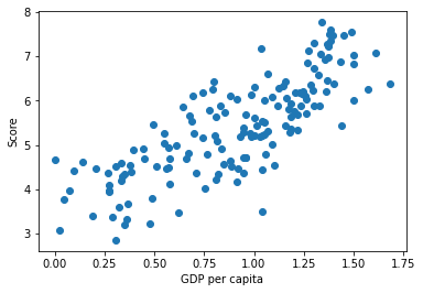
The result shows the positive correlation that a country with higher GDP per capita has a higher overall happiness score. This makes sense to me since usually a country of higher GDP per capita usually has better living quality and more advanced technology, which are likely to influence people who live in those countries to be happier. Thus, the overall happiness score is higher in those countries.
Better Plots
The plot above may have helped us understand whether or not there's a relationship between the overall happiness score and GDP per capita. However, there are several variables in this data set, and we don't want to manually re-run the plot for each pair of variables. So we can get a more systematic view of the correlations in the data.
# define your function
def scatterplot_matrix(cols = ["Score", "GDP per capita", "Social support"], figsize = (10, 10)):
    """
    Create a scatterplot matrix with a separate scatterplot for each possible pair of variables. The first variable is on the horizontal axis, while the second variable is on the vertical axis.

    Parameter
    ----------
    cols: a list of strings, each of which are the name of one of the columns in the happiness dataframe (assume ["Score", "GDP per capita", "Social support"] as the default value)
    figsize: an input tuple represents the size of the figure (assume (10, 10) as the default value)
    """

    # create empty subplots based on the length of cols and figsize
    fig, ax = plt.subplots(len(cols), len(cols), figsize = figsize)

    for i in range(len(cols)): # loop over each column in the created empty subplots
        for j in range(len(cols)): # loop over each row in the created empty subplots
            ax[j,i].set(title = cols[j], ylabel = cols[i]) # add the first variable name as title and the second variable name as y-label
            if i != j: # if row number and column number are not the same, which means the subplot is not on the diagonal
                ax[j,i].scatter(happiness[cols[j]], happiness[cols[i]], marker = ".") # make the scatterplot with certain columns of two variables in the happiness dataframe and mark as "."
                correlation_coefficient = np.corrcoef(happiness[cols[j]], happiness[cols[i]]) # use np.corrcoef() to calculate the correlation coefficient between those two variables
                ax[j,i].set(xlabel = r"$\rho$ = " + str(np.round(correlation_coefficient[1][0], 2))) # choose, round, and add correlation coefficient as x-label on the x-axis of each subplot

    plt.tight_layout() # avoid squished plots
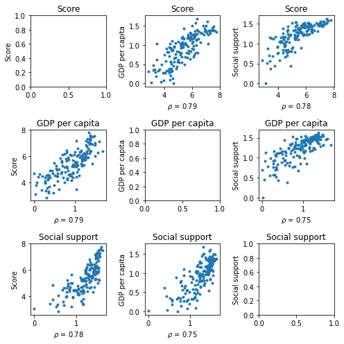
cols = ["Score",
        "GDP per capita",
        "Social support"]

scatterplot_matrix(cols,figsize = (7,7))

# code demonstration with observations below
cols = ["Score",
        "GDP per capita",
        "Social support",
        "Healthy life expectancy",
        "Freedom to make life choices",
        "Generosity",
        "Perceptions of corruption"]

scatterplot_matrix(cols,figsize = (20,20))
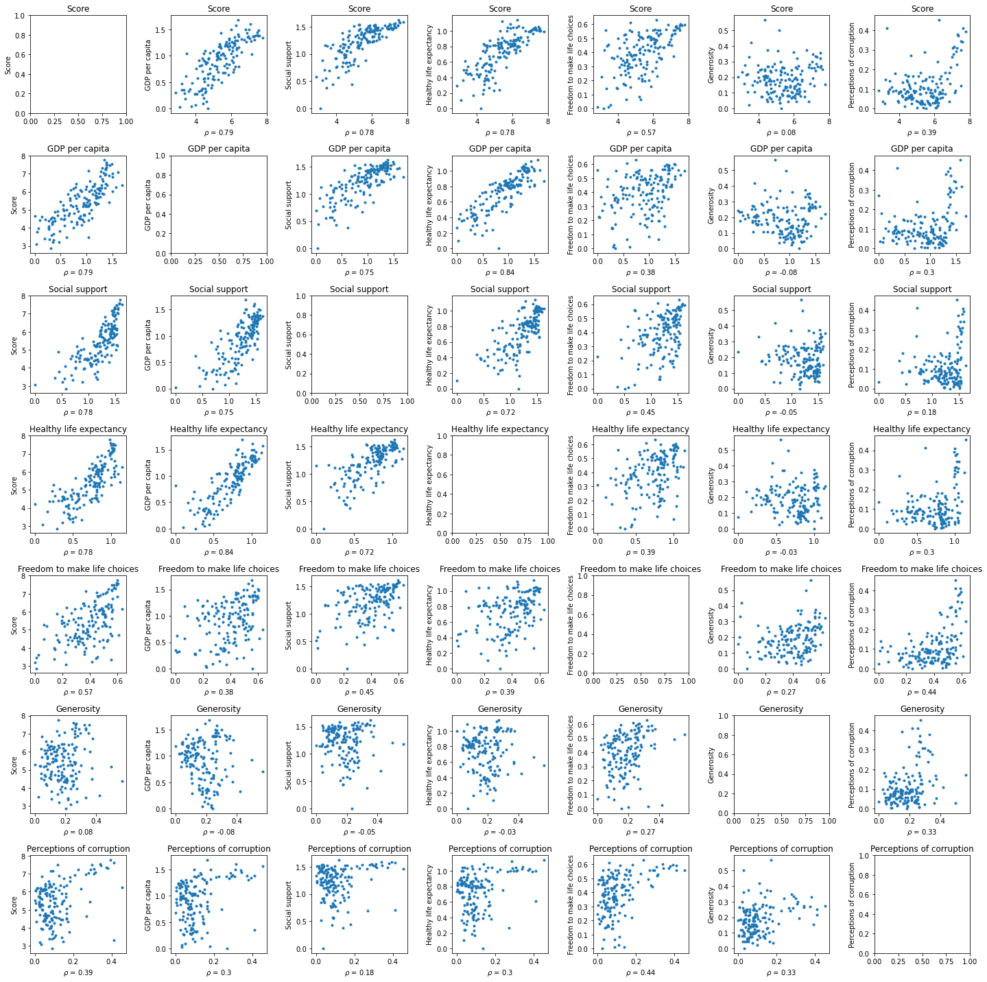
Observations (skip repetitions of two same variables):
- Score vs. a variable
Country with higher GDP per capita has a higher overall happiness score.
Country with higher social support has a higher overall happiness score.
Country with higher healthy life expectancy has a higher overall happiness score.
Country with higher freedom to make life choices has a higher overall happiness score.
Country with lower generosity has a higher overall happiness score.
Country with lower perceptions of corruption has a higher overall happiness score.
- GDP per capita vs. a variable
Country with higher social support has higher GDP per capita.
Country with higher healthy life expectancy has higher GDP per capita.
Country with higher freedom to make life choices has higher GDP per capita.
Country with lower generosity has higher GDP per capita.
Country with lower perceptions of corruption has higher GDP per capita.
- Social support vs. a variable
Country with higher healthy life expectancy has higher social support.
Country with higher freedom to make life choices has higher social support.
Country with lower generosity has higher social support.
Country with lower perceptions of corruption has higher social support.
- Healthy life expectancy vs. a variable
Country with higher freedom to make life choices has a little bit of higher healthy life expectancy.
Country with lower generosity has higher healthy life expectancy.
Country with lower perceptions of corruption has higher healthy life expectancy.
- Freedom to make life choices vs. a variable
Country with lower generosity has higher freedom to make life choices.
Country with lower perceptions of corruption has higher freedom to make life choices.
- Generosity vs. a variable
Country with lower perceptions of corruption has lower generosity.
Compute the correlation coefficient between two or more variables
The correlation coefficient is a measure of linear correlation between two variables. The correlation coefficient between X and Y is high if X tends to be high when Y is, and vice versa. Correlation coefficients lie in the interval [-1, 1].
# code demonstration
cols = ["Score",
        "GDP per capita",
        "Social support"]

scatterplot_matrix(cols,figsize = (7,7))
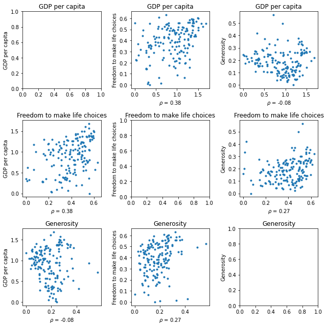
cols = ["GDP per capita",
        "Freedom to make life choices",
        "Generosity"]

scatterplot_matrix(cols,figsize = (9,9))